Monday 30 November 2009

Panoramic Photography

If you're wondering how to produce panoramic images and "360×360"-degree "bubble" images like the one used for the Airbus 380 website, there are three main methods:
  1. Use a special panorama camera. These typically mask off the lens so that only a thin vertical slit is exposed. The camera is mounted on a tripod with a clockwork mechanism that pans it across the view, and the rotation process winds the film onto the spool, past the slit. This used to get used a lot for school group photographs.
  2. You spend a vast amount of money on a special custom-made fisheye lens. In the (1980's?) a photographer made a bit of a splash using one of these to produce fish-eye cityscapes. People hadn't seen anything quite like it.
  3. Nowadays: you use pretty much any digital camera with a bit of auto-compositing software. Some cameras even have a crude landscape-stitching facility built-in (even my mobile phone does it!)
If you want to do this properly, and you can run Windows software, the Google search term to remember is Autostitch.

It's downloadable from the University of British Columbia's site, and the Windows demo version is free for non-commercial use. They just ask that if you upload anything to the web, you use "autostitch" as one of your tags, so that they can see what people are doing with it. The user-interface is pretty much non-existent – lots of scary number-boxes for people with wierd lenses – but really all you have to do is leave the defaults as they are, click "File / Open", select the pictures you want assembled, and then click the "Open" button and go make a cup of tea. When you come back, you'll probably have a perfect panoramic image. If you want a friendlier front-end, they license the library of routines to commercial software companies, who'll be happy to sell you a less clunky implementation. They've licensed it to George Lucas' Industrial Light and Magic, and there's even now a version of Autostitch for the iPhone.

Autostitch automatically works out the right order to arrange your photos, compensates for lens distortion, compensates for tilt and zoom, assigns angle values to pixels, works out how best to mesh them together, downgrades "inconsistent" parts of individual photos so they don't contribute as much to the final picture, adjusts the colour balance and exposure of each photo to merge in with its neighbours, and then smoothly crossfades everything together.

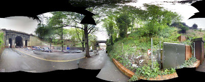
Here's what Autostitch really generated for the above photo, before I cropped it to remove the black gaps (where hadn't taken a photo for the program to use) ... it's not something that you'd normally want to show someone, but it shows how much mathematical cleverness is going into the fitting process – this is NOT just simple "image-tiling" software:

The authors' research paper ("Automatic Panoramic Image Stitching using Invariant Features", Matthew Brown and David Lowe) goes into this in a lot more detail, with sample pictures.

If you use a 360-degree sequence of images, the Autostitch output will rotate seamlessly from side to side in your graphics-editing software, and if you take a 100% bubble sequence, there are Flash applications that can re-generate the view you'd see by looking at any horizontal or vertical angle (if you still haven't tried the Airbus demo, go now!).

If you don't need a wraparound view, and you have a tripod and a notepad and some patience, you can use a larger zoom setting on your camera than normal and take a LOT of overlapping pictures of a static scene. This lets a cheap five-megapixel camera easily generate monster hundred-megapixel images ("output image size" is one of the more understandable boxes on the "scary parameter page"). It's good to have a couple of "test goes" at this technique, so that on that one fateful day when you're confronted with a perfect picture that's too tall or wide to fit into your camera view, you can rattle off a sequence of overlapping snaps, knowing that Autostitch should be able to assemble them when you get home.

The one real limitation of Autostitch is that it's currently only set up for merging photos taken from a single point. There are some situations where you might want to auto-undistort and tile a sequence of photos taken from different locations: for instance, if you were photographing a mural painted on a long wall, you'd probably want to take a series of images from different locations along the wall and have them all assembled side-by side to form a long strip.
Autostitch doesn't yet do that. But maybe they might add the feature if enough people ask.

Friday 27 November 2009

The Airbus A380 cockpit

Airbus A380 cockpit forward view, extracted from http://www.airbus.com/store/mm_repository/cockpit_airbusA380/flash/cockpit1.htm , photography by www.gillesvidal.com .This is a cut-down still of part of the Airbus A380 cockpit, taken from airbus.com. It's from a panoramic viewer, on a page that uses Flash to let you pan and tilt and zoom in and out of a view in any direction, so that you can really explore the cabin in detail, in high-res. If you want to look out of the window, look backwards, or look up at the ceiling while it spins, you can do that. The mouse scrollwheel zooms you in and out. It's nice. The 360-360 photography is by gillesvidal.com.

The A380 is a very nice plane, with a famously-great cockpit control surface layout. It has a comfortable, relaxing, reassuring look to it (as opposed to some of the more traditional layouts with lumpy panels and dials everywhere all screaming "Look at MEEE!"). It doesn't look scary – as a newbie, you can look at this user-interface and half-kid yourself that you might actually be able to fly it.
My concern when I first heard about the Airbus' screen-based system was: what happens if a screen develops a fault, and you lose a whole bank of virtual instrumentation? Well, the A380 panels tackle that problem brilliantly – you notice how the eight main portrait-format screens all seem to be the same size? Well, they're completely interchangeable. You're supposed to be able to pop out any of the main screens and swap them round, live. There's a couple of little grey rectangles below the bottom two corners of each screen panel, presumably those are the finger-latches. And apparently you can completely change the layout, so if one panel's connection points are messed up, you can watch its data somewhere else. I like this plane.

So let's explore ...
Twin side-joysticks and QWERTY keyboards. I don't know what those two rounded plastic bulges are ... perhaps they're calming devices, for the pilots to put their hands on in moments of stress. Or maybe they're there so that if you get thrown towards the panel, you have something to grab onto that doesn't accidentally result in you pressing an Important Switch by accident.

Three spare seats at the back (for parties), and an overhead camera (so that you can remember what you did the next morning). Fun Wagon!

Note the video camera views, on the centre screen. Useful for parking, and also for reminding yourself which airport you're at. Also for checking that you still have the right number of engines, that none of them are on fire, that all your control surfaces are present and correct, and that your wheels haven't fallen off. Without cameras (or a periscope), it's not always easy to know if your wheels are really down, because planes tend not to have glass bottoms. The central panel showing the video views is the obvious "spare" section of control surface to use in flight for additional functions if further equipment is retrofitted that needs its own display space (like customised additional avionics – rocket launchers, anyone?). There's a pull-out shelf thing in front of each seat that gives the pilots additional keyboards and pop-up screens for general flight admin and map-browsing.

Very Importantly: what looks like three cup-holders per side, left and right, away from the important controls, plus another five at the back left. It's deeply important to have enough cup-holders (one for fresh coffee, one for water, and one for soup, or perhaps noodles?). That's assuming that the holes aren't for something more boring. There's a clunky laptop-py thing at the back, for system-level stuff.

I like the documentation holder on the back of the door, made out of two types of sticky tape. But what's that panel in the door, with the nasty scratch gouged in it? Is it a “people” version of a cat-flap? I also like the design of the door-hinges, with the hinge protruding inside the cabin, and the screws accessible. That means that the cabin crew can remove the door from its hinges from the inside, if it jams (say, after a crash). Someone's put a lot of thought into this.

Twin microphones (for karaoke duets? Pilot-copilot comedy banter?). Between the "emergency power" and "oxygen" switches overhead (up above the left windscreen variable-speed wiper knob), there's also an intriguing switch marked “Entertainment”. Hmm.

Rear right, there's what looks like a locked cabinet marked CDROM. Well, if the Batmobile has one, I suppose the 380 ought to have one, too.

"Escape rope" compartments on both sides. Down to the rear left, by the fire extinguisher (whose sign I initially misread as “portable fire eating”), there's a hatch set into the floor. I've seen this hatch drawn on a schematic with a ladder poking through that exits through the front wheel port. I guess this means that if you're a pilot and you have a panic attack before takeoff, you can pop down through the floor and run away across the airfield without the passengers realising that you've gone.

The seat covers have large tags facing each other saying "Pilot" and "Copilot", which might be useful for resolving cabin arguments. Point at the tag. 'Nuff said. Also handy for avoiding those embarrassing "But I thought YOU were supposed to be flying the plane!" moments.


So, a very nice vehicle.

The only design decision here that I'd query is the upholstery. Pinstripe? Hmmm. But perhaps there's a reason for that, too ... perhaps striped material doesn't show sweat stains so easily. You don't want to be settling down into your seat for a long-haul flight, and be too conscious of the big sweaty patch left by the previous pilot. Eurgh. I wonder how often they change the covers?

With the addition of deep-pile furry tiger-pattern seat covers, vibro-back-massagers built into the seats, a proper entertainment system with giant speakers, and a couple of foot spas, I'd give this cabin 10/10.

Monday 23 November 2009

The Relativistic Ellipse

Relativistic Ellipse, v=0.8cThis is an especially cool diagram for relativity theory, but it's rather hard to find in print. There's a limited version of it in Moreau's 1994 "Wave front relativity" paper, and I put it in the book (chapter 8), but I can't think offhand of anywhere else you're liable to find it.

It's simply an ellipse with lines radiating from one focus and converging on the other.

Imagine that you have a point-source of light giving off pulses. Surrounding the point-source is a spherical mirror, which catches the outgoing spherical EM wavefront and bounces it directly back to the source. All parts of the reflected wavefront arrive back at the source at the exact same moment.
This tells us (a) that all parts of the surface are at 90 degrees to the source, and (b) that all parts of the surface are at the same distance from the source.


=Relativistic Aberration=

Now let's replay the same situation, but imagine how it would have looked to us if we were whizzing past the experiment in a spaceship (but not so close that we actually disturbed the light in any significant way).

Now, the geometry seems to be different. We're forced to agree that the reflected wavefront still converges on the emitter (because nothing within the experimental region has physically changed), but since the light takes a finite time to go out and come back again, as far as we're concerned, the experimental hardware has been moving while the light was out doing its thing.
For us, the light was being emitted from one position and refocused at another.

And the shape that does that is an ellipse.

If we look at the shape of the relativistic ellipse, we find that the outgoing rays are angled forwards ... they have to be in order for them to be able to keep up with the "moving" source. And if we measure the angles of these rays on the diagram, it gives us the textbook relativistic aberration formula used by special relativity (and also by Newtonian optics, old ballistic emission theory, and any other relativistic model).


=Velocity-rescaling, distance and time under Special Relativity=

The thing that's slightly counter-intuitive about the diagram is that if the radius of the sphere is half a light-second, and if it's supposed to take exactly one second for the light to return to its starting point (so that the bouncing light makes a clock that supposedly ticks every second), you might expect the distance "v" that the object moves in one second to simply be the distance between the two points. Slightly perversely, under SR, it isn't. The relative proportional velocity v/c (velocity quoted as a fraction of the speed of light) has to be the ratio between the focal point distance and the stretched, longest dimension of the ellipse. So if the distance between the focii is half the length of the ellipse, we can say that the velocity is half lightspeed
(in the diagram above, it's 0.8c).
But since the ellipse is stretched, the distance between the points (if v is defined as a particular fraction of the speed of light) is stretched, too. If we're to follow SR and say that lightspeed is a fixed global reference, then the distance between bounce-points is somewhat more than v metres.

Under special relativity, the width of the ellipse is assumed to be constant regardless of velocity, the ellipse is stretched by the Lorentz factor (calculated from our proportional velocity), and the "point-to-point" distance ends up elongated by the Lorentz factor, too.

Under special relativity we explain the extra distance by invoking Lorentz time dilation. We suggest that the particle travels further than expected in our coordinate system in one of its own seconds, for a given nominal velocity, because its clock is running slow (so for us, it travels for more than a second,and crosses more than v metres). Or we can argue that if an observer moving with the experiment sees a piece of paper with the diagram drawn on it passing by with the same proportional velocity of v, that for them, the distance between the marks is v metres, because their measurements indicate that the moving paper is Lorentz length-contracted. The ellipse looks like a giveaway that lightspeed isn't globally fixed, but if we assume that it is, and need to explain why the ellipse somehow doesn't really count as an ellipse, we end up with the traditional SR length-contraction and time-dilation explanations.

Contract the elongated ellipsoid by the magical gamma factor, and its outline turns neatly back into the original sphere.


=Doppler shifts=

The next thing that we can do is to look at the length of the lines. Turns out that, if we're doing the SR version of the exercise, each ray elongates or shrinks by precisely the right ratio for special relativity's relativistic Doppler effect. The forward and rearward distances are stretched and squashed by the ratio SQRT[(c-v)/(c+v)], and the 90-degree-aimed ray is stretched in length by SQRT[1 - vv/cc].
That's the Lorentz transverse redshift prediction of special relativity.


=Ellipses are Cool=

So this one little diagram tells you almost everything that you need to know about special relativity. Once you've drawn it with the appropriate proportions for a given velocity, all you have to do is read off the angles and distances with a protractor and ruler to find SR's physical predictions about the appearance of a moving body, as seen from any angle.

If you'd prefer not to rely on any "odd" theory-specific definitons of velocity, distance or time whenbuildign the ellipse, all you have to do is draw in two rays from a focus, with lengths rescaled by the theory's particular Doppler shift predictions, and the rest of the diagram constructs itself. Along with the Minkowski lightcone diagram, it's probably one of the most powerful diagrams in special relativity.

So why isn't it in the books?

We-ell, perhaps the problem with the diagram is that it makes people think. Which leads to troubling ponderings, because it turns out that the diagram doesn't have to be used with special relativity. It'll compute the SR relationships if we deliberately stretch the point-to-point distance by the Lorentz factor, or if we use the SR "relativistic Doppler" relationships to define the reference wavelength-distances, or if we decide that lightspeed has to be defined as globally constant for all participants ... but if we're only interested in the principle of relativity, and we're not prepared to commit to these extra SR-specific things, the ellipse also lets us plug in other assumptions, and lets us see the their consequences.

For instance, we know that old Newtonian optics was technically a "relativistic" theory (although nobody could get NO to work properly with wave theory). We know the forward and rearward wavelength changes associated with that theory, so we can draw in these two wave-distances from one of the focal points, and construct the rest of the ellipse around these maximum and minimum radii. What we end up with is an exact duplicate of the SR ellipse, with the same proportions and aberration angles, but with an additional Lorentz magnification. All the NO wavelengths are longer than their SR counterparts by a Lorentz ratio. So transverse redshifts aren't unique to special relativity.

And then you notice some other things. The SR ellipse can be compacted back into its original circular outline just by contracting it on one axis. This is analogous to tilting the diagram off the page to produce a contracted "shadow", which gets us into the subject of Minkowski spacetime, tilted planes of simultaneity, and other cool things. The SR family of ellipses actually represents constant-width tilted cross-sections through a constant Minkowski lightcone and can be visualised as projected conic sections.

The SR version of the constructed ellipse is the only one that has this special property.
This tells us that if we require spacetime to be "flat" in moving-body problems, the SR relationships are the only ones that work. We're still freetoargue argue about the correct philosophical interpretation and presentation of the theory, and about whether the interpreted contractions and clock-changes are physically real or not (and about what wemean by "physically real" in the context of SR), but the defining Doppler characteristics of the theory – the things that dictate the final physical predictions and equations ofmotion, regardless of interpretation – are set, locked and non-negotiable once we've decided that we won't be implementing curvature as part of the model. According to the ellipse, Relativity (limited to simple inertial motion) plus flat spacetime gives SR. It's airtight.

If we now go back to the enlarged Newtonian version of the ellipse, we find that the rules are different. The enlarged NO wavelengths can't be fitted back into the original sphere without distorting the centre of the ellipse out of the page. Instead of a tilted-and-rescaled cross-section through a fixed geometry (Minkowski spacetime) we end up with a geometry whose shape dynamically changes when there's relative motion between physical masses. Instead of a purely "projective" tilt, we have a real physical change of shape. The causal structure of the metric now depends on the presence and motion of physical bodies embedded with it. We end up with a gravitomagnetic theory, with a different form of lightspeed constancy to SR. And that's why nobody, including Einstein, could put together a sane-looking reference model for Newtonian optics that didn't go crazy when you tried to treat it as wave theory. Newtonian optics simply doesn't work in flat spacetime. The wavelengths don't fit.

I still think that it's a shame that they don't teach the relativistic ellipse in physics classes. It's a powerful tool, and a really handy device for demystifying special relativity. But perhaps it's too powerful, and perhaps if you're trying to convince a class that SR is the only possible answer, a tool that suggests the existence of alternative approaches spoils the narrative.

Monday 16 November 2009

Social Media and the Gooeyverse

World of Goo: crowd sceneSome "social media" guys have taken to bitching about the term "social media". They feel that it doesn't adequately describe what they do. It doesn't make them feel sufficiently ... special.

Well, there's two ways you can go. Either you replace the term "social media" with something more specific, like "Interactive social network enablement systems", or you go the other way, and invent a brand new buzzword that's shorter, snappier, and more subversive-sounding.

In which case, I vote for "Goo".

Goo is the amorphous, gelatinous set of shifting organic interconnections and linkages that binds and connects us all together. It's not a restrictive "web" or a fixed "net"-work. It's goo.
A locus of goo, like Twitter or Facebook, becomes a gooball. The connections between gooballs, the part of the internet that deals with crosslinks between social media hubs, becomes the intergoo. The global user environment for goo becomes the Gooeysphere, the view from within is the Gooeyverse. "Intelligent" software support for goo ("web 2.0"-based automatic book recommendations, and so on) becomes smart goo. Goo generators like Blogger or Wikipedia, that let users spawn new collections of goo connections are hypergoo.

Corporate blogging and twitterring becomes Blue Goo.

It also ties in well with the idea of links between software and wetware ... and the fact that a Graphical User Interface – the thing that you look at when you use a piece of software – is referred to as a GUI (pronounced "gooey") doesn't hurt, either.

All good clean fun.

Trouble is, how are you going to explain to your mother that you have a career in goo?

"Social media" doesn't sound so bad now, does it?

Wednesday 11 November 2009

Villarceau Coils, Slinkies, and Ring-packing

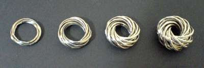
Four Villarceau Coils, Eric Baird 2009Computer graphics are fine, but the problem with programming a simulation of something is that often you only get out what you put in. You lose the element of surprise. So sometimes, if you you want to find out what something really does, you build one. Available technology and spare parts permitting, of course.

For the "Villarceau Coil" blogpost, I figured that it was worth making a physical model. A good hardware place nearby sells middle-sized keyring loops for 15 pence each, so I went in with a few quid and came away with a pocketful. Then it was just a question of clipping the things together.

There were a couple of things that I hadn't expected:

Thing Number One
was that a "keyring Villarceau coil" is a bit like a Slinky. You put it on the palm of your band, or on a flat surface, and tilt the surface, and the thing kinda ... slinks ... downhill. It reacts to the uneven pressure on its base, rings rotate and slither past each other, the torus squirms and turns inside out, and the thing scuttles off down the slope with a slightly guilty air about it, like an octopus running along a seabed.

From a science-fiction/xenobiology point of view, the coil makes an interesting template for a possible alien lifeform. With a soft toroidal body and a hard set of spiny Villarceau rings, an animal could burrow or shred predators or food by turning itself inside out. It could start as a skinny beastie with maybe three rings, and grow more rings as it got bigger and fatter. It'd solve the problem of how to reconcile a hard exoskeleton with the ability to change size. Young could be gestated as full-size rings within the fleshy body. Giving birth would probably have to be be kinda fatal, though, unless the rings each had a notch somewhere. :(

Anyhow ... Drop the coil, and it "splashes" when it lands, then reforms back to the torus shape ... or if you've used a lot of rings, into a pair of interlinked tori. You can pop it on your finger, and pass it from hand to hand, one finger at a time, by tilting your finger to point downhill towards the destination finger, so that the v-coil slinks down the finger, turning itself inside out as it goes.

So basically, a fun executive toy. Three quid well spent.

Thick Villarceau Coil, Eric Baird 2009

Thing Number Two was that the rings have a natural tendency to nest (as in, "what Russian Dolls do", not "what in birds do") .... except that, in this case, the self-similar "dolls" are all made from components that are exactly the same size. Which is a slightly wierd situation.

So if you start with maybe just three rings for a skinny torus, and you add more rings to force the thing to be fatter, you find yourself using a lot more rings than you thought. They start to form nesting toroidal layers. Since every torus that you can produce using the Villarceau configuration has exactly the same major radius as a single ring, they all fit neatly inside one another.

It's kinda reminiscent of the way that electron orbits stack up around an atomic nucleus.

And since every ring in the set of nested tori has exactly the same configuration to all the others, you can reach in and pull an inner ring and with a bit of shuggling turn it into an outer ring (while one of the outer rings shuffles back inward to take its place).

This is a FUN shape. You could probably write an entire book about it.

Thursday 5 November 2009

String Theory and The Goodies

The 1990s "string theory" boom was an example of what happens when a critical mass of researchers realise how to game the system. If enough people start churning out work on the same subject, and eagerly citing each other in multi-author papers, they levitate up the scientific citation indexes together. You get a bubble. It's in most players' interests to keep inflating the bubble – the more new people they attract to the subject, the more seniority they have in a growth area of science. It becomes like a pyramid scheme. So in the 1990s we had some pretty absurd claims being made for string theory and what it was going to do for us, and when.

I wasn't unsympathetic to string theory as such - It seemed like something that needed to be researched ... just not by everybody. The talk was that string theory was The Future, and sometimes it seemed as if anyone who wasn't already committed to some other line of "mathematical physics" research was scrabbling to get onto the bandwagon. There were people doing worthy work on the subject before the boom, and once the bubble burst, those people would probably continue doing worthy work. What was wrong was the hype.

And all though this time, I kept remembering the old 1970's episode of The Goodies, where the guys use their advertising agency to promote string as the wonder product that's good for everything. Here's just the clip of the Goodies "String" song, courtesy of YouTube:


"String, string, string, string, ev'rybody needs string!"

It also seemed to me that we'd been here before. String theory was supposed to be a ToE, a "Theory of Everything", but in the 1990s, it actually seemed to be more of a ToA, a "Theory of Anything". It sounded like a great way of being able to remodel any given physical theory, but didn't seem to offer any clues as to what sort of theory we should be trying to model. It sounded was a bit like Jean Luis Borges' fictional "Library of Babel", that contained every book ever written, and every book that might ever be written - but whose total inclusivity meant that it ultimately contained no information at all.

String theory in the 1990s seemed to suffer from the same problem that aether theory had had in the 1890s - what had made aether theory lose credibility as a subject wasn't that it gave wrong answers, or that it was limited – its problem was that it was too flexible. With enough arbitrary variables, you could construct an aether model to reproduce almost any behaviour you could possibly want – we had aerodynamic aether theories, sink-and-source aether theories, Lorentzian ether theory (LET), and so many other variants that even experts started to lose track of them. Without a guiding set of principles to eliminate possibilities, generalised aether theory as a field couldn't actually make any solid falsifiable predictions.

Aether theory had degenerated into a "Theory of Anything", and if you eventually managed to isolate a set of rules to derive a single preferred set of physical relationships from some amophous theoretical soup, then the process of logical deduction that you'd used to decide on a particular set of properties for the theory, was the theory.

And the worry with string theory was that perhaps some people in the "string" community hadn't quite understood this. Some of its more enthusiastic proponents insisted that string theory was already "discovered" – string theory was fundamental truth, and "all we had to do now" was to learn how to decode it. But without the decoding process there was only a metatheory that defined a context within which an actual physical theory might later emerge. Without an extraction process we might as well be trying to divine "ultimate truth" from tealeaves or goat entrails.

It also didn't help that the "We already have the secrets of the universe in our grasp, we just need to take a few more generations to work out how to decode them" argument, the apparent nonchalance about the lack of falsifiability, and the use of "mystical" language to try to attract public support were all things that people more usually associated with the Nostradamians and Bible Code numerologists than with the physics and math communities.


There was only so long that the string theory hype could last without the subject actually making any physical predictions, and eventually the field got hit by a nasty dose of reality, with Lee Smolin and Peter Woit both publishing critical books on what had actually been achieved. There simply wasn't a physical theory yet. Just because something was pretty didn't automatically make it physics.

I was happy to criticise when the hype was underway, but I'm uncomfortable kicking a theory when it's already down. It's too easy. Good work is probably still being done with string theory, it's just not getting headlines in New Scientist every single week as it used to. Perhaps the fashionistas will drift away and find some other fad to attach themselves to, and it'll be just the hardcore guys left, who were there from the beginning, and aren't reliant on a fortnightly press release cycle. And perhaps that's an appropriate situation.

Heck, if it gets too fashionable to knock string theory I might even have to start defending it.

Meanwhile I'm going to watch the video again. "String, string, string, string ..."